App Design for Currency Transfer

This is a case study based on a live product that I worked on, similar to Revolut. In this particular case, we had to give the customers the possibility to send money abroad to bank accounts in foreign currencies, while transferring directly from their RON account.
SUMMARY
- Business challenges
- Concept creation
- Testing a prototype
- Refined based on test results
- Test again
- Conclusions
- 2 Product Owners
- 1 Project Manager
- 1 UX/UI Designer
- 2 Mobile Developers (Android/iOS)
- 3 Backend Developers
- 1 QA Tester
1. Business challenges

The requirements for the exchange transfers were pretty straightforward and simple to understand. The business department needed the ability for the customers to send money to foreign currency bank accounts, but until then, they wanted the user to see the exchange rate, which also should be updated in real-time once every 1-3 seconds, plus the ability to change the amount transferred any time while adding beneficiary details and lastly users should be able to save beneficiary details because these were some long forms to deal with.
Their idea was to break things down to:
- one exchange simulator
- one transfer process
- one flow to select a saved beneficiary
This meant that we had to add 2 or 3 more entries to the drawer menu of the app.
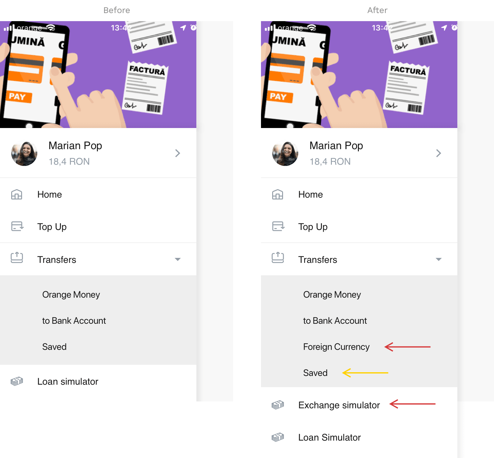
Certainly not a nice picture and solution. The menu drawer already had lots of entries, separating transfers by category was not the best deal, but because of deadlines we had to keep transfers this way and adding another simulator did not help at all. So many choices = cognitive load.
- one exchange simulator - transformed then into - one transfer process - where you can also - choose a saved beneficiary
What I want to emphasis here is the fact that while business may have the best interest of the customer in heart, it’s our job as designers to put things down well on a path that mixes the business requirements, ease of process for the customer and not giving developers a headache.
The result was to only add the Foreign Currency entry in the menu and begin with that. If the customer likes the exchange rate, the process of adding beneficiary details can begin. After one short meeting, everyone was on board.
2. Concept creation
After we had things settled regarding the process and the journey of the customer, with some messy hand-drawn wireframes and doodles, it was time to jump straight to the digital wireframing/first visual draft.
Seeing that the lack of time was an issue, my next goal was to accelerate the process and make some time for testing 1-2 user flows. Although it was a simple concept to grasp, I was afraid the journey might surprise us along the way with unexpected problems or user errors.
On top of this, I also had to keep in mind to re-use as many components as possible. Input fields, text size, labels, colors, all had to be similar to what was already used in the app. Not only for the sake of consistency but also for making this easier on the mobile developer’s part.
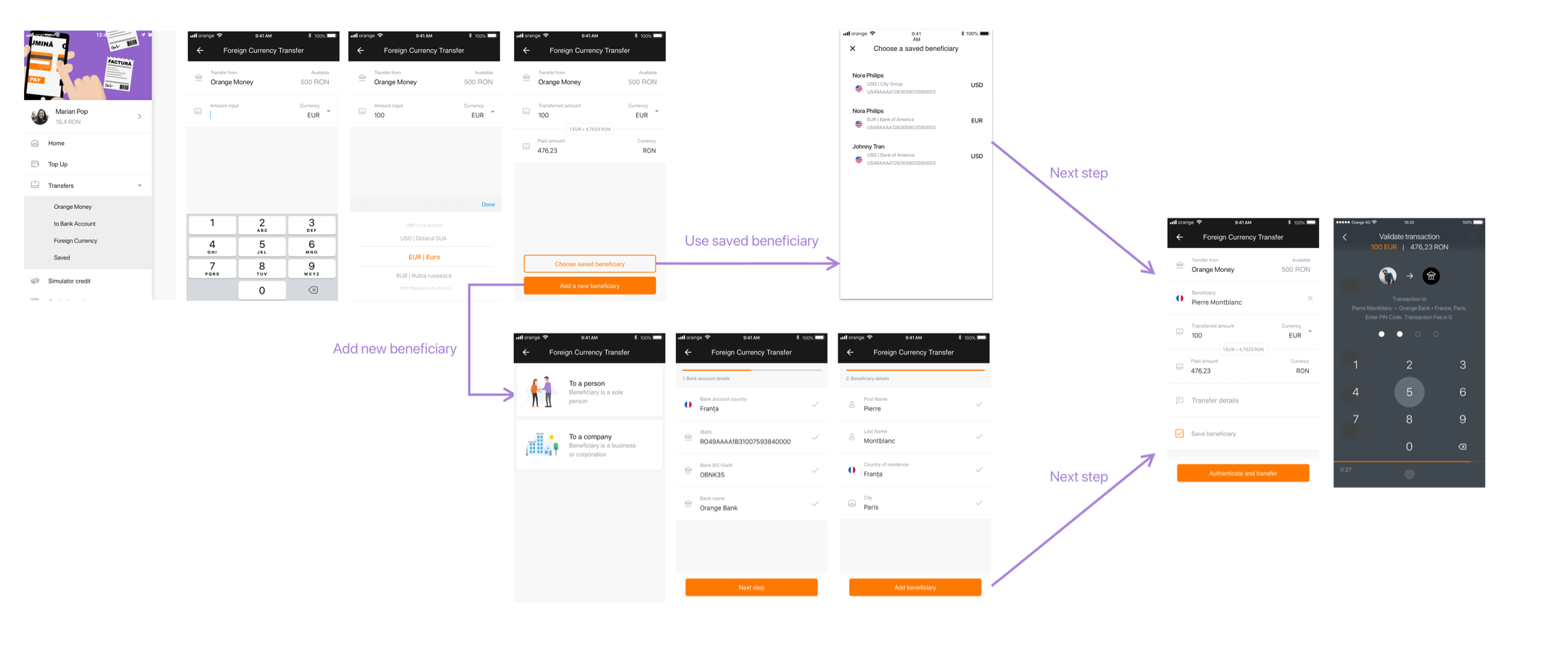
So here are some summarized screenshots of the journey for transferring 100 EUR to Pierre in France from someone in Romania.
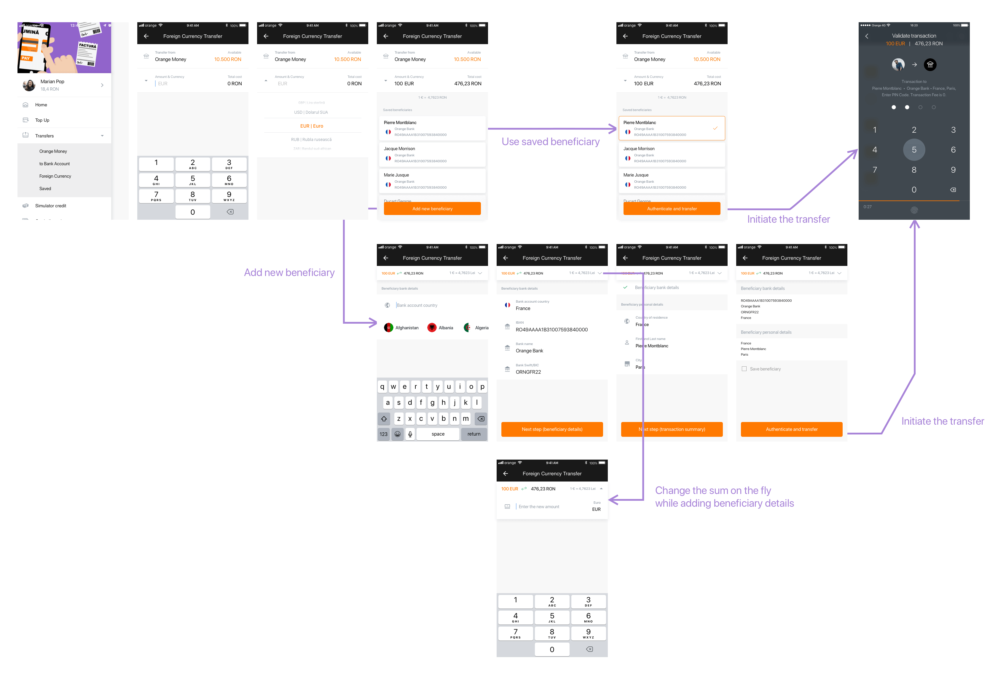
The testing prototype had a few more extra screens for increased interactivity, so what you see above are just the main screens of the user flow.
3. Testing a prototype

Seeing users testing the app for the first time is something… different. What you had in mind and expected could very well be the opposite or you might start questioning the fate of humanity. The thing is though, reacting defensively or emotionally to test results is a path to disaster. Ignorance did not help anyone, especially when building a digital product.
While I was hoping for time to do user interviews, we had to take a shortcut, meaning another, faster way to test a prototype. Maze was a lifesaver and I can’t help recommending this tool enough. It gives you the ability to import a prototype and send it to users for testing. After that, it generates comprehensive reports about how the prototype performed.
We used 19 testers (people from inside the company that knew the product, mixed with people in the industry that didn’t work on the product).
Maze works like this:
- Import your Invision / Marvel / Figma / Sketch prototype.
- You set up some tasks/goals for the user to complete.
- You actively go through the prototype to complete these tasks where you tell Maze, this is the path the user should follow to achieve the goal.
- You choose a finish/end screen to mark as “end of the path”. If the user arrives here, the task is successful.
Test tasks for users:
- Select USD and enter the amount of 100 to transfer.
- Transfer 100 EUR to Pierre in France.
- Begin transferring 100 EUR again to Pierre and then change the sum to 200.
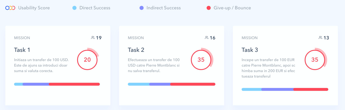
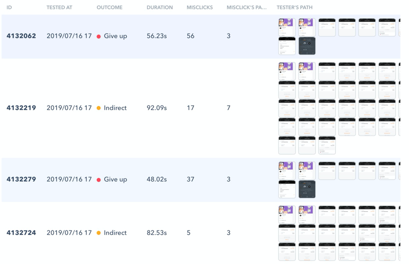
Here’s the first thing that went wrong with this: too many goals. Yes, 3 tasks were too much, people gave up immediately. On top of that, these tasks were not so clear. The only clear task was number two and not even this one performed well.
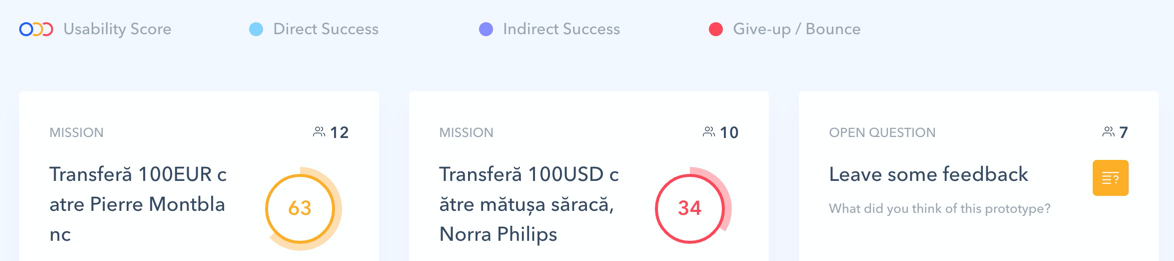
Tasks success scores:
- 41% success rate.
- 50% success rate
- 51% success rate.
There were quite a few problems with the interface design that created confusion and made people give up and not complete the tasks anymore.
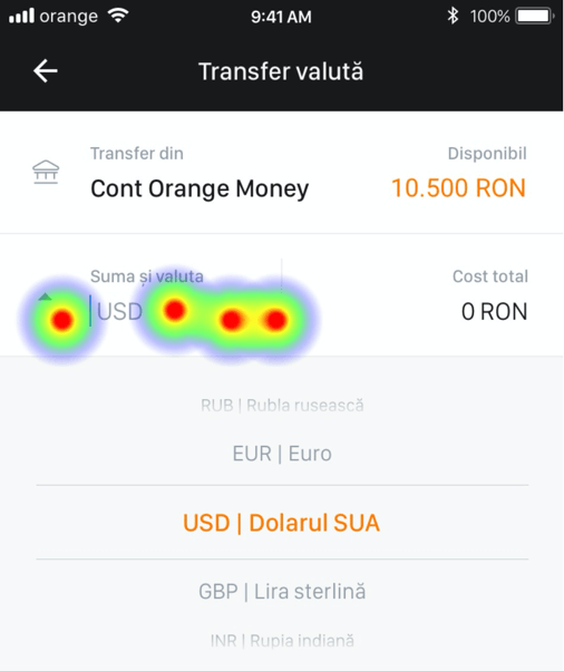
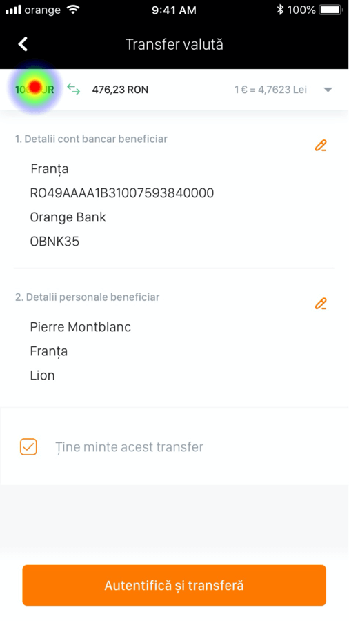
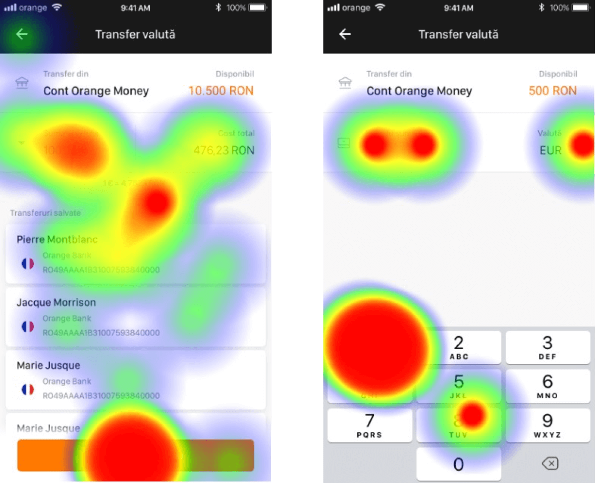
In every task, one problem was the input field of the amount & currency dropdown selector. Users could not tell the difference between these two because they were so close.
The more misclicks you have, the lower your usability score will be. This translates to the fact that the user needs to discover the way of doing things by opening and closing paths that do not makes sense at first sight.
It was clear that this input field had to go through some thinking.
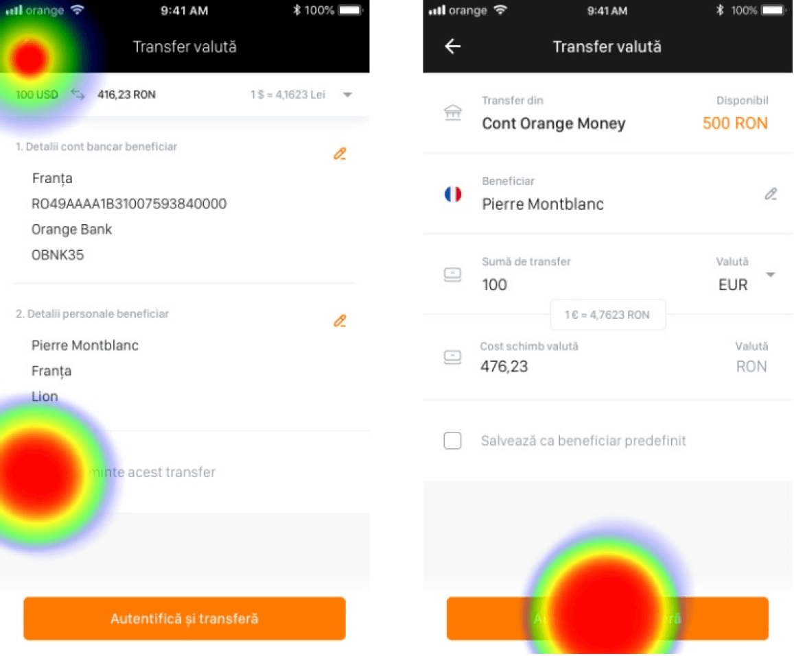
Another unexpected problem was that 90% of testers could not figure out how to change the amount after they introduced the beneficiary details.
The top right dropdown arrow was missed a lot of times. It looked like users didn’t notice or give enough attention to the entire screen and their focus is mostly at the center of it.
Given the success scores and the fact that the rest of them simply just lost interest and closed the test, it was clear that the whole flow of the process needed a rework.
Here are a few more screenshots from the beautiful reports Maze generates:
4. Refine based on test results

So with the results from the first testing sessions, I went back to the drawing board and made quite a few significant changes. Here are some conclusions:
- create two simple tasks
- separate currency selection from input amount
- adding beneficiary details should feel like taking a second path to reach the goal
- use more already available components, strengthen the consistency of the app
5. Test again
Test tasks for users:
- Transfer 100 EUR to Pierre in France.
- Transfer 100 USD to aunt Nora in the USA.
Test success scores:
- 91% success rate.
- 60% success rate.
There are quite a few things that went better here. In this case, we can’t compare rigorously the two design flows, but with some radical changes, the main task of transferring a sum of money certainly went better in the second version.
Regarding Maze’s Usability Scoring, I’m not sure how you would achieve something close to 100. The thing with these tools is just that data/scoring is something relative. I was more focused on learning about problems, rather than achieving high scores for some abstract numbers.
Still, I will leave here comparable screens from Maze in case someone is interested.
6. Conclusions
About the user interface design:
- The new amount & currency picker reduced the misclick rate considerably. Users also spent less time on these screens because input fields looked more intuitive. Notice the much more focused tap areas on the second screen rather than the scattered taps on the first iteration.
- The last summary screen also improved a lot. Instead of users going back and not understanding what is happening and how they can change the amount transferred, the second version made things much more clear. On the plus side, the second screen now looked very similar to the first one and it seemed that users loved that. It’s possible that in their mind they “added” something to their inventory for making this transaction.
About Maze and prototyping:
-
The way you build your prototype will influence your test results. Something overly complicated will lower your success rate. People can’t grasp the concept of a prototype, so they expect to insert numbers, even if you mention that it’s a prototype. I have a suggestion here for Maze: For each testing session, greet the users with a welcome message where you mention shortly what a prototype is.
-
People will get bored very fast, especially when they know they are testing something. My recommendations: small goals explained in short tasks.
-
Expect people to try to “break” your prototype. Yes, this was one explanation I received when I asked someone why they spent so much time completing the tasks. They were just messing around trying to discover more screens, hence the more random taps and messy navigation.
-
Take all the results with a grain of salt. Interpret the data and don’t jump to conclusions just because one person could not manage something very simple. Some people just won’t pay enough attention, other people will rush. Remote testing is not that precise.
-
With many possibilities of navigating through the prototype, you will create frustration and increase the chances for your users to reach dead ends. It’s best to craft a proper path with 2-3 small deviations and record the number of misclicks. If you have lots of them, it means things are not intuitive, hence it’s way easier to extract good conclusions.

All of this process was done in an entire week while dealing with other work-related matters, but in the end, it was worth it. We had a great start and direction, ready to tackle the development part.