


Good and Bad Things About Figma in 2021
If this is your 348th article on why Figma is better, I would like you to bear with me, because I will try to present you more than general features such as “Figma is better because it also runs on Windows”.
The Good
After I switched to Figma, my expectations were surpassed pleasantly, considering that I was reluctant in trying a browser-based application. In the end, I was impressed and Figma remained easily my number one tool. For a free account and no operating system constraint, this software comes with good and bad at the same time.
Figma is miles ahead in performance
Performance is easily the number 1 factor that made me switch to Figma. Thankfully it lived up to be the best decision, although I was skeptical at first. How could a web app surpass the performance of a native app such as Sketch? It looks like a product made in C++ and served on the browser through Web Assembly can function really well.
The only thing that saved Sketch is the M1 chip of Apple, which improved the performance due to the new chip, but it doesn’t look like something was done to fix the issues on Intel processors.

With Figma, I managed to create over 20 pages, each one with 10-15 web-sized artboards, without breaking a sweat. The only thing I noticed was that it took a bit longer to load the entire project when launching it.
Fragmented design systems and states
Something that I was not prepared for when I switched to Figma was the number of options when it comes to creating a design system. Figma lets you build this robust design system with a lot of capabilities of intelligent override when it’s needed, without affecting the base elements.
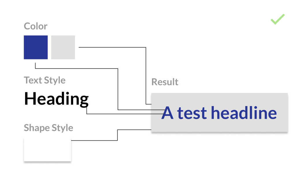
So you can see here that each element adds together to the desired result and forms a component. This is how Figma handles fragmentation and it’s done in a smart way. I can go ahead and override any color, text style, or shape style, without actually changing the original of these.
As an exercise of imagination, Figma lets you put and take out from your recipe each individual ingredient without altering them from the beginning.
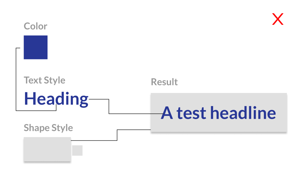
Now here’s how Sketch and Adobe XD are handling the components/symbols. This is more similar to preparing small chunks of ingredients before putting them in your “bowl”.
While it may seem a good way to contain the designer in re-using elements from the design system, it actually manages to get in the way. For example, you are not able to have two separate Headings, one blue and one black, without actually creating them in the first place. That means you already have 2 styles. Add justification (left/center/right) and now you have 2*3 = 6 styles.
In Figma, you get two separate colors and 1 text style, while in Adobe XD only the alignment is independent.
Prototyping and Developer Handoff
After you get a platform that lets you design fast and be flexible, the next step is getting the design out there, whether it is for testing with users or handing out the mockups to the developers.
Nice surprises
While using Figma I’ve got plenty of nice surprises that I was not expecting, which improved my daily workflow.
A small detail, but with significant importance, is changing the layer names after swapping the component/symbol. In this way, layer names stay organized and are easier to navigate. This is not only important for the designer’s workflow, but also for developer handoff.
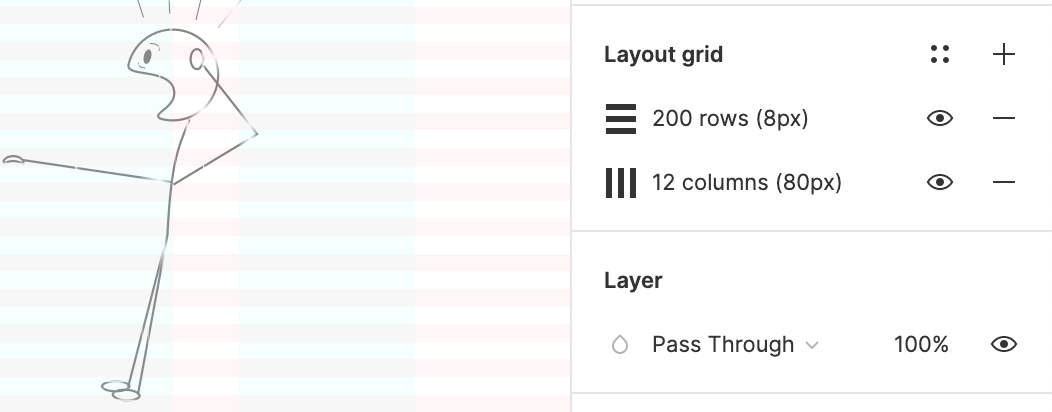
When it came to setting up grids, I was pleasantly surprised to notice that Figma allows you to control and refine them in a better way. On top of that, you can create presets of grids. This is helpful when you are designing for multiple screen sizes so you don’t end up constantly changing the grids from a menu.
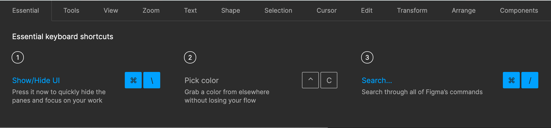
If you like shortcuts and constantly find yourself in the need of learning new ones, Figma has an entire panel where you can access it quickly, instead of aimlessly searching on the web or obscure places in Mac keyboard shortcuts.
The Bad
Sharing is invasive
Most of my issues when it came to Figma originated from collaborating and sharing artwork with team members and stakeholders. Ironically enough, a tool that facilitates collaboration can go a bit too far at the expense of, let’s say, intimacy.
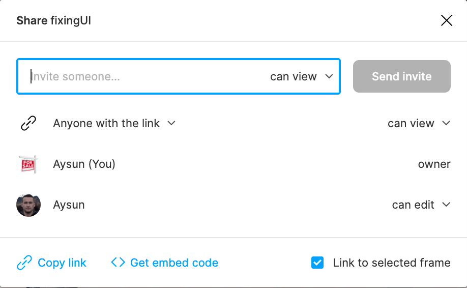
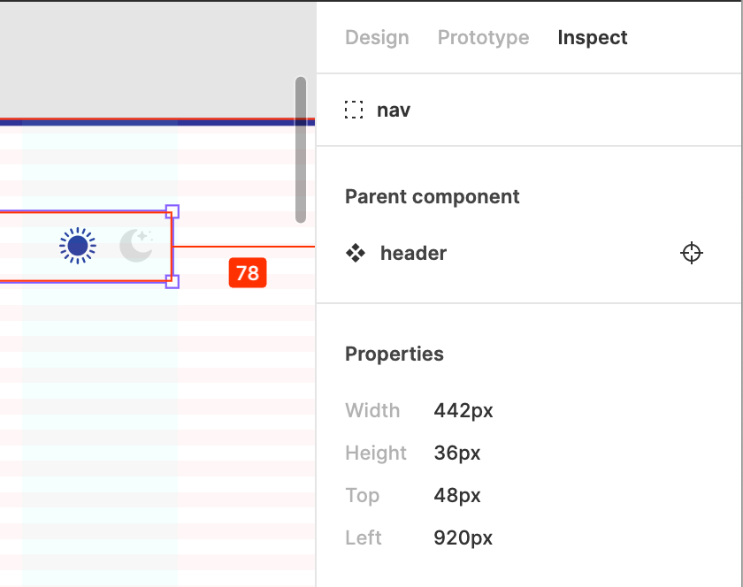
Take the above example when you try to share the “Homepage” artboard. There are two ways to share your work in Figma. You either create a link to a specific artboard or create a link to a prototype.
You would think that a prototype only lets you jump between the predefined actions in it, but in Figma, you are free to navigate between pages (5.1 figure) and artboards that the designer didn’t intend for the client to see.
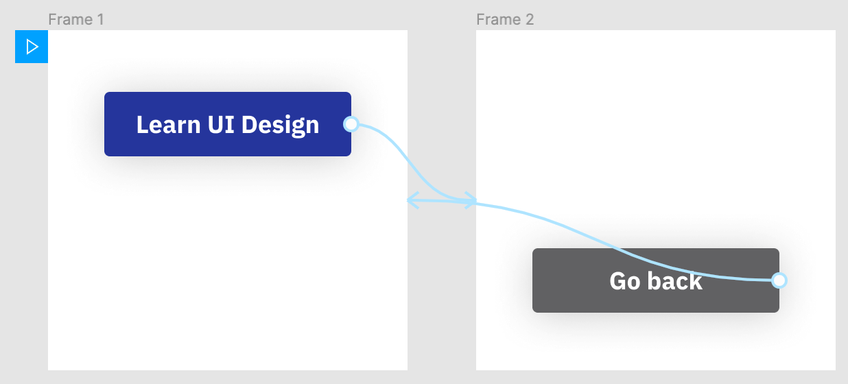
Maybe you have work in progress or ideas/drafts noted down that are not yet ready to be shown. Looks a bit intrusive to me and the only workaround I found was to create a separate project.
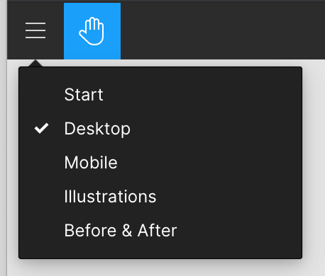
In figure 5.2 above, the blue “Play” icon shows the starting screen of the prototype. This means that:
- You are sharing a link with a starting artboard
- If you change the starting screen, the old link becomes obsolete.
- You can’t link between artboards from different pages
The business analyst I was working with was constantly bumping into dead links of prototypes or artboards that were present in our project management tool. Suddenly I was finding myself in a position where I had to duplicate and create more artboards, create very similar workflows, just to let those links live.
Elements grouping is confusing
When you switch to Figma you have to forget about Masks and try using Frames instead. The CMD/CTRL+G shortcut creates groups by default, but they are only useful for grouping elements.
The Frame works just like groups, but it lets you create clipping masks, so they are apparently suited more for entire artboards (an artboard is also a frame) and images.
Masks are something that I could not get a hold of and had to just drop them. Regarding these, the way Sketch treats groups/masks is more intuitive.
The UI panels need depth and contrast
Being a browser-based platform, Figma can design their layer and properties panel and have more control over them, unlike a native Mac app such as Sketch or Adobe XD.
Even now I think the UI lacks contrast and have trouble identifying quickly where a specific setting is located. Sketch looks like is making better use of whitespace and the new Big Sur update helps it even more.
Figma’s competitors will soon look obsolete
The trend is there already, more and more people are switching to Figma. Looking at the overall progress of Figma, the fact that they launched and refined features that bring power to designers, while making sure the app functions properly and is not getting in the way, is true UX in itself.
