
UI Example 1 | Redesign & Clean Up a Traveling Website Homepage
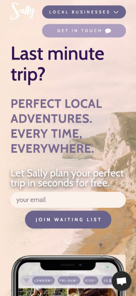
Let’s try to clean up a traveling website that tries to do too many things at once. It doesn’t take a designer to notice that the above layout is messy and hard to scan. On top of that, the call the actions are all fighting for the attention of the user.
Top header navigation
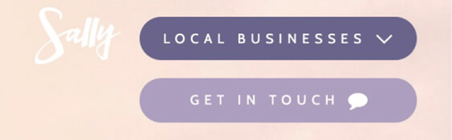
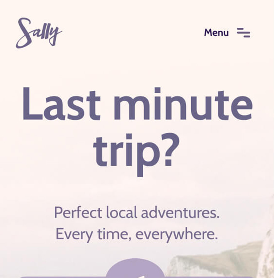
As you can notice I fixed the logo color, so now it’s visible and passes the accessibility contrast. The background color saturation was reduced a bit to increase the contrast with the other elements.
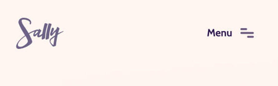
The two buttons were taking too much space so they were replaced by a menu button, which is universally recognizable. With more room to breathe, I cleaned up the top space and now I am letting the user’s eyes move easier to the next section, which is more important (header area & value proposition).
Headings sizes & colors
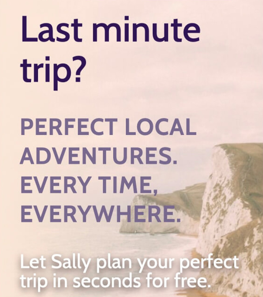
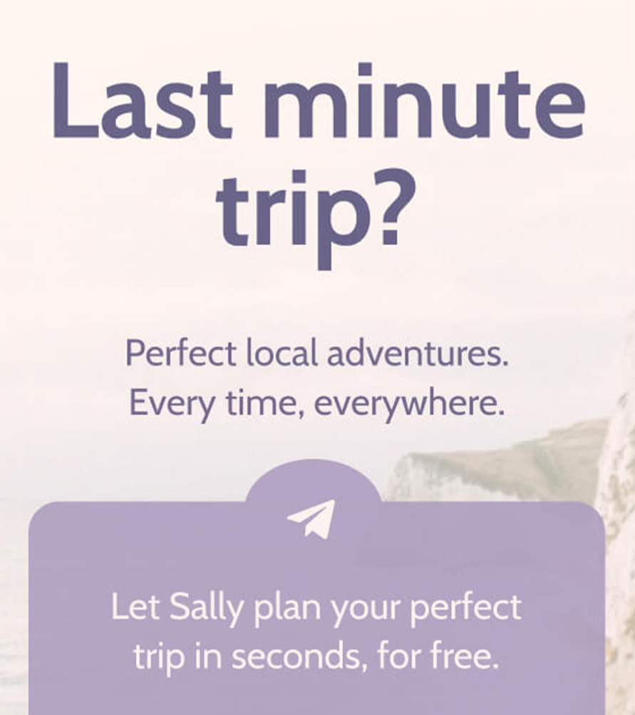
I decided to center everything here since most of the wording was pretty short. A beautiful contrast is achieved easier when there are few elements of different sizes. Most of the time type size will influence more the contrast, rather than color or font-weight.
After centering the elements, I chose to separate the form from the title and tagline, while still keeping the same size between these two. Notice how the title creates a focal point and draws the eye of the user, and it’s easier to notice because I removed the two buttons from the header.
While the “perfect local adventures…” has a supporting/decorative/descriptive role, the “let sally plan” acts as an incentive. By using a different background color or white space, I created a subtle hierarchy while still keeping the same text size.
Bottom area

Fully rounded input fields and buttons are generally good to be avoided unless you are designing for a very specific theme or following brand guidelines. In this case, aligning things by width will help the eye of the user scan faster the section.
Large leading (space between letters) on buttons is generally to be avoided unless you are in search of a very specific look. Try to use this when you are in luxury or high-tech futuristic looks, but for this case here I decided that it’s better to go a safer path.
Lastly, notice that I placed the word “questions?” under the floating button at the bottom. Although the icon was doing the job by itself, why not try to compensate with this when we decided to remove this button from the header.
Going further
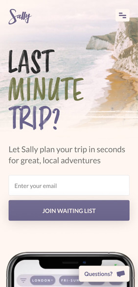
The redesigned example looks good, it follows most of the original layout, it’s pretty clean and straightforward. What looks like is missing here is personality, a little touch of character, and a memorable impression.
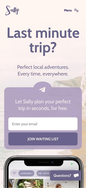
The choice of words can dictate how your layout will look and flow. What if we remove or adjust some of the words and maybe even try a new font for the title since we decided it’s a focal point in the entire layout.
Removing some elements will create a cleaner composition and at the same time, contrast is increased because space is freed up. The more whitespace, the better. Since I also have this real estate available, why not go ahead and bring up the background?
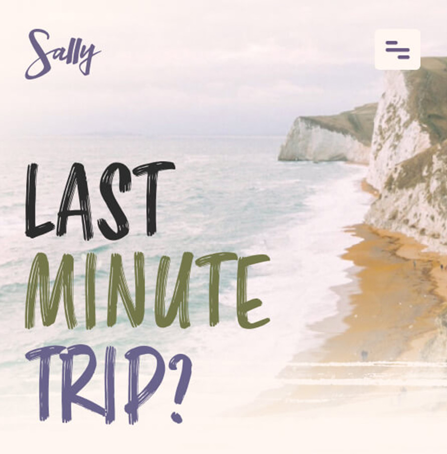
The first half of the mobile view it’s the first thing the user sees. Instead of being greeted by a solid, basic sans-serif font, how about making it a bit more organic? This is about trips, going to the beach, mountains.
The marker effect font goes great with the choice of words also. “Last minute trip” is sudden, impulsive, it’s chaotic and disorganized, just like quickly writing something to remember an idea.
At the same time, the centered layout was ok, but not great. Before we had short words trying to fight for the width of the screen, but now every word has its own horizontal space and is enlarged, easier to read.
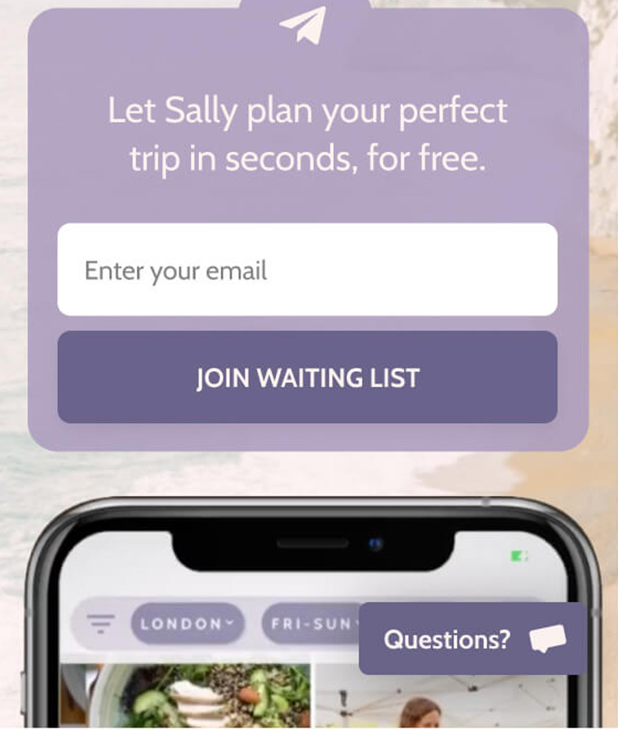
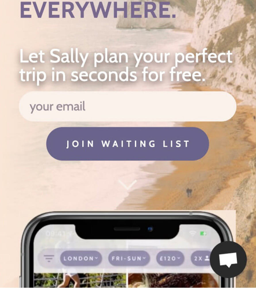
The redesigned form looked fine, but it was taking space and obscuring the background a bit unnecessarily in the hopes of bringing the form to the attention of the user.
What if I can achieve the same by removing elements? Now with a faded background from the top, we have the proper color to place the wording and input fields. The two phrases (decorative and incentive) were merged into one simple phrase, followed by the form.
With a subtle gradient, corner radius reduced and a fine drop shadow applied to give depth, I created a button that stands out more and calls for interaction after the user finished reading the title.
Notice how there’s also more whitespace between elements, so the user is able to scan faster between elements (heading, form, app screenshot).
Lastly, I made the bottom chat button a different color so now it stands out more and is not fighting for attention with the submit button above.
Putting it all together
- The new design relies more on whitespace and less on words to communicate a message
- With more whitespace available, content is easier to scan
- When stuck with layout decisions, try digging deeper and challenge the choice of words